
Has this happened to you?
You are running a piece of research and you look at the results from the first 50 respondents and it looks like a really good story is emerging. You are seeing some big differences in how some of the people are answering some of the questions start to come up with theories as to why. You get exited and you build a whole story about what the data is saying and all seems to make perfect sense.
Seeing and spotting trends in data is what we all love to do, in fact that is largely what our brains are set up to do, to spot difference and try an interpret them. It all too easy to come up with ready answers to explain why say men over 35 would prefer this brand of shampoo or why high income groups like cheese more than low income groups....
You then go away and wait for the full sample to answer the survey and when you get the results back back the data differences you saw initially have all evaporated. The patterns you were seeing were in fact noise that you were treating as signal. When the noise is statistically accounted for you are left with a sea of dull homogeneous data with little or no stories to pull out.
Welcome to with world of overfit!
The term literally means "over fitting" theories on data that was not statistically robust enough to validate these theories.
... And it's incredibly dangerous. Particularly in circumstances where you are researching niche sample groups that are difficult to reach and you end up with a completed survey with not enough sample. This is a particular problem in the world of health care and BtoB resesarch where samples are hard to access.
It's difficult for us to get our heads round just how random random chance is, even with large numbers.
So what does random look like?
Toss it 50 times and very rarely would you get exactly 25 heads and 25 tails. It will happen only one in 10 occasions roughly.
In fact with 50 coin tosses there is a 60% chance that there will be be more than 20% difference - so the differences in the data looking like this chart below would in fact be the expected norm.

If you had 20 question in the survey you would expect at least 1 of them by random chance to have difference of 50% or more which looks like this....

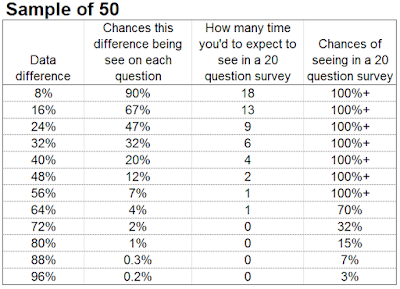
Here is a summary of the data difference you would expect to see in a survey of 20 questions sampled to 50 people.
Here also is similar data for samples of 100 (sorry not done this for larger samples it a bit of a pain to work out!)


How to be confident you data is reliable?
Simple trick is to divide it in 2 and seeing if both halves say that same thing. Then do it again 20 times and see how many times its the same. If its the same 19 times out of 20 this is the definition of 95% certainty. The number of times out of 20 times by 5 will determine exactly how reliable your data is. You can go a step further and divide the data in 4 and then look how often is the answer the same. If all 4 cells give the same answer you are sitting on some quite robust data.
No comments:
Post a Comment